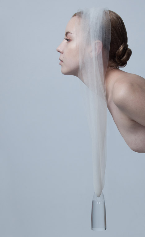
Dutch designer Teresa van Dongen has filled a glass tube with octopus bacteria to create a zero-electricity lamp that glows blue when disturbed (+ movie).
Design Academy Eindhoven graduate Teresa van Dongen wanted to recreate the natural phenomena of bioluminescent waves – a spectacle that occurs when oxygen mixes with seawater, causing aquatic bacteria to glow brightly.
Her idea was to harness this effect to create a lighting fixture that could be activated by movement, rather than with electricity. She calls it Ambio.
"For a while now I have been doing research into new forms of light and energy," said the designer, who studied biology before embarking on a career in design. "My goal is to create a living lamp for the home."
Although there are many different species of bioluminescent microorganism, Van Dongen selected one that can be scraped off the skin of an octopus – a decision influenced by both the degree of luminescence, and whether movement resulted in either a pulse of light or a longer reaction.
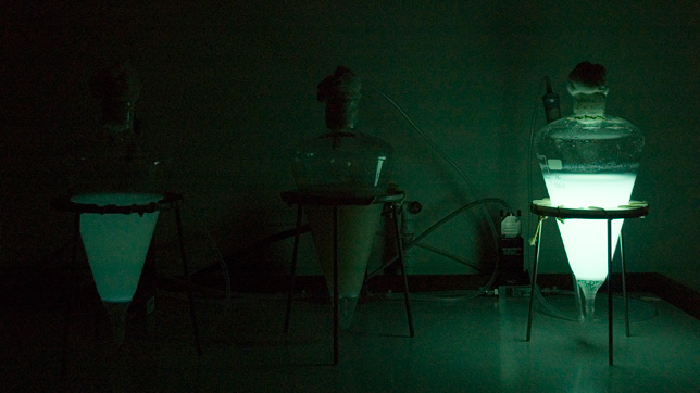
Working with two students from TU Delft's life science department, the designer has produced a prototype comprising a tube of artificial seawater suspended between two brass weights. A wool cap ensures a regular stream of oxygen.
A gentle nudge of the lamp disturbs the bacteria, causing it to glow. The weights will prolong this movement, keeping the lamp illuminated as long as possible.
The drawback of the design at present is that the microorganisms can only live for two days before they either run out of nutrients or multiply too much for the tube. The team is currently working on a solution that will extend their lifespan.
"Our aim is to create an installation where new medium with nutrients – liquid food – is constantly added to the fluid with bacteria while the abundant amount of fluid is constantly drained, without using electricity," said Van Dongen. "In this way we can theoretically keep the population alive for an eternity."
This chair by Design Academy Eindhoven graduate Govert Flint allows the user to control their computer cursor with a range of body movements (+ movie).
Govert Flint designed the Dynamic Chair to facilitate movement in all directions, then worked with programmer Sami Sabik to translate the motions made by the sitter into actions on-screen.
"I started to think about how we make chairs that are disconnected from their activity. Working in the office is an activity we sit for. From then on I tried to design a chair based on body movements."
Separate elements form a back, a seat and a pair of leg supports, which move with the body independently from each other.
These are all made from polyester padding upholstered in wool felt and supported by a frame made from welded iron sections.
Three accelerometers positioned around the chair measure movement in X, Y and Z directions.
Collected data is then transferred along wires to a computer, which is programmed to use the information to move a cursor around a computer screen positioned at the sitter's eye level.
One sensor located below the seat calculates the chair position relative to the X and Y planes. The user's shifts forward, backward and side to side move the cursor in corresponding directions on the screen.
Sensors placed on both legs click the cursor when a swift kicking motion is detected.
Although the technology currently only allows for the operation of a cursor, the designer hopes to extend the idea so it works with the full computer interface.
"For the future development we would like to collaborate with software developers and programmers to design an interface based on body movements," said Govert. "Also, the keyboard will have to be replaced by body movements in a more precise manner."
"For the consumer product the entire computer will have to function comfortably with body movements," Govert added. "This will need further development."
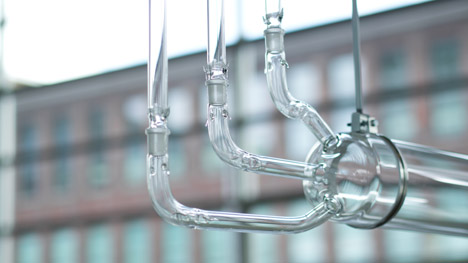
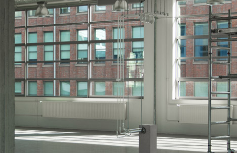
Dutch Design Week 2014: smells of sweat, grease and metal waft from the glass tubes of this installation, created by Design Academy Eindhoven graduate Mickaël Wiesengrün to add historical context to its setting in a former factory.
Mickaël Wiesengrün's Révélateur installation aims to evoke the previous use of its location using smells that would have been present there.
"It puts out the smell of the past," Wiesengrün told Dezeen. "I wanted to do this to contextualise the present with the past, it's a bit of nod to the past to understand why we are here."
The Design Academy Eindhoven building where the institution's graduate exhibition is hosted was previously used by Dutch technology company Philips as a lightbulb factory.
Wiesengrün worked with Norwegian chemist Sissel Tolaas to create the scents of sweat, grease and metal, which he believes represent what the building might have smelled like during production.
"It's the smell of hard work; of the hard workers who built this place and who are indirectly why we're stood here today," said Wiesengrün. "It's very important for [visitors to the exhibition] to understand about back then."
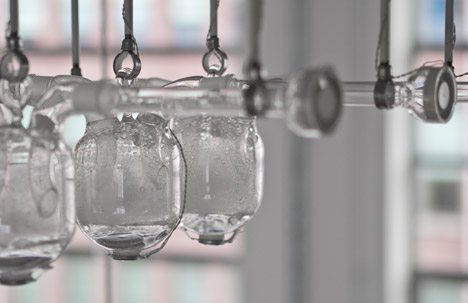
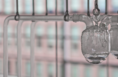
To disseminate the smells and create visual intrigue, the designer has built an installation of glass beakers and tubes.
"People tend to neglect smells in [exhibition] contexts and just go for the visuals," Wiesengrün said.
Each of the three chemical "smells" are dissolved in water and held in separate beakers, which are suspended from the ceiling above head height.
Ultrasonic vibrations are used to change the liquid into vapour to give the smells a physical manifestation.
Suction draws the fog down through the three tubes, which are mixed in a larger horizontal chamber before the combined smell is blown out from a floor-standing plinth.
The tubes are broken in the middle, approximately at nose height, so each of the scents can be sampled individually.
"This also has connotations of a factory production line, where you can open a pipe and really gather information from the process," said Wiesengrün.
The project relied on the collaboration with Tolaas, who uses chemistry to recreate smells from reality and was previously involved in making human cheese.
She will continue to work with Wiesengrün when the installation moves to new locations and needs a new set of scents.
"I've always been fascinated by smell," Wiesengrün said. "I grew up in Chamonix, in the French Alps, and was surrounded by forests. Every time I smell forests, I get flashbacks of where I grew up."
"I'm not interested in creating smells, I'm interested in shaping them using fog, which has the ability to transmit the smells."
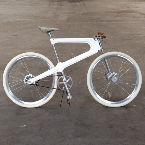
Dutch Design Week 2014: the frame of this bicycle by Design Academy Eindhoven graduate Bob Schiller is made using automated processes borrowed from car manufacturing, which the designer hopes will allow production to return to the Netherlands (+ slideshow).
For his graduation project, Bob Schiller wanted to design a bicycle that could be both built and used in the Netherlands – a country with a rich cycling tradition and manufacturing history.
"Every single person in the Netherlands cycles – even our prime minister uses his bike to get to work," said Schiller. "Cycling is part of our culture and it has been for centuries. However, an affordable, contemporary Dutch bicycle disappeared from our streets."
Most mass-produced bicycles, which are labour-intensive to build, are now made in Asia as costs are cheaper than in Europe.
"I think that's a shame, with all of our experience we should be able to make the best bikes in the world," said Schiller. "It's not only about economical benefits but also about sentiment."
Schiller's solution is to automate the processes used to create the frames by borrowing techniques from the car industry, which has managed to retain production in several European countries.
The frame of the Epo Bicycle is formed by pressing two sheets of aluminium into shape then fusing them together using spot welding – a process that fuses metal with heat generated by an electric current.
Both the pressing and welding can be done by machines, therefore saving on the cost of labour and making the city bike affordable to produce in the Netherlands.
The deep aluminium section connects to the seat support in two places, doubling back on itself where it joins the handlebar pole. The welded edges are exaggerated to emphasise how it has been constructed.
"In the design of the frame I wanted to show this process," Schiller said. "That's why I chose the sharp lines and high edge that visually splits the frame in half."
The wheels are mounted to the side of the frame so the tires can be changed without taking the bike apart, while brake levers are integrated into the ends of the handlebars.
The concept design requires further calculations to assess the strength and stiffness of the frame before it is ready for production.
Schiller is currently looking for an investor to help fund the startup costs, and is also considering crowdfunding an option to raise the required finances.
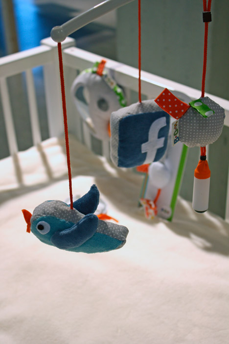
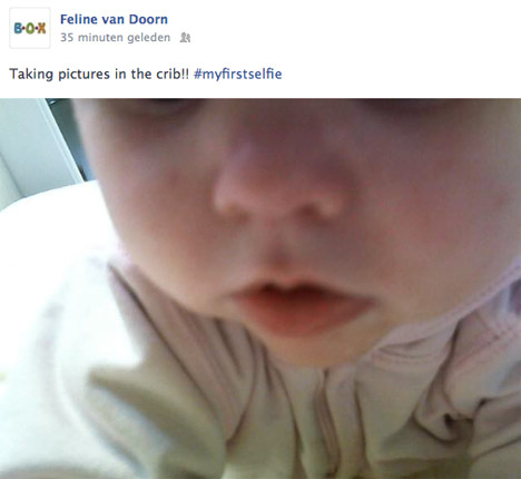
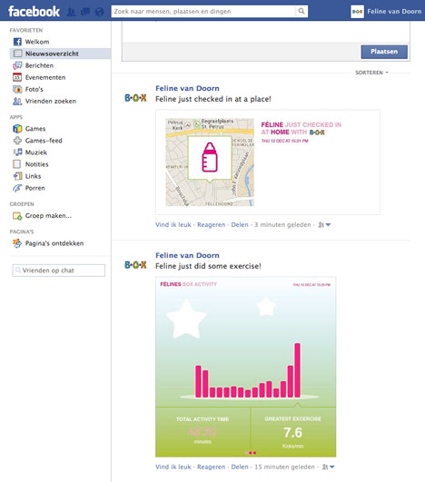
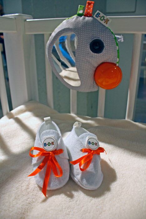
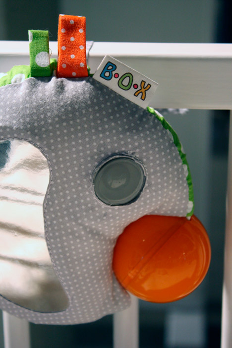
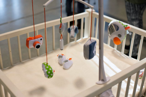
Dutch Design Week 2014:Design Academy Eindhoven graduate Laura Cornet has created a set of toys that allow infants to upload their own photos, videos, locations and activities to social media before they're old enough to use a computer.
Laura Cornet has designed a collection of soft toys that includes a mobile, a clip, a ball and a pair of shoes.
Each captures visual information or data, activated using simple gestures that can be carried out by a very young child, and automatically uploads it to a social network.
Cornet came up with the idea for the New Born Fame project after her own Facebook feed became increasingly inundated with photos of her friends' babies, which she wasn't entirely comfortable with.
"I thought it was weird to be involved in the life of someone, who doesn't even know that I have seen everything in his life already," said Corner. "And the baby couldn't make a choice to maybe not show me."
She began asking these friends and acquaintances about why they posted photos and reports on their kids' progress onto sites like Facebook.
"At first, I talked to people whose babies were in my timeline, but later on I talked to friends of friends, who also had babies and who had spread the word on my project," Corner said. "I also talked to a few parents who absolutely didn't put anything online, to get an idea of the other side as well."
Some were very defensive about their right to post photos of their children onto social media sites.
Their justifications included that their accounts were private so that only friends could see the images, that Facebook wouldn't do anything with the photos and that they believed that their friends want to see, comment and "like" the updates.
"But then when I mentioned if they asked the kid for permission, a few already started questioning," explained Cornet. "All of the people replied that I was right about asking that."
To stir debate about this issue, Corner decided to put the control in the baby's hands and created a set of toys that the he or she could use to "put themselves online".
A mobile of soft hanging items, shaped like birds, a camera and a Facebook logo, incorporates a sensor-activated camera that films the baby from above.
When the child reaches up, the camera records a short video then automatically uploads it to a linked-up Facebook page.
A round clip that looks like a clown's face posts its location to the same online profile when squeezed, using a GPS signal.
By turning a small ball, the baby takes a photograph of themselves that is also automatically uploaded with a randomly generated caption.
Finally, a pair of shoes work as an activity-tracking device – monitoring the wearer's movements and sharing the captured data.
"I've positioned it really as a statement to show to those parents who put everything online that the problem isn't privacy anymore, it is much broader," said Cornet.
"It raises the question: 'who owns the right to put a baby on the internet like that?'. I question if the mother or father in this case actually should be the ones to decide."
The tools aim to plainly demonstrate that an infant has no idea that it is providing information about itself to an audience, in the same way as when a parent does it for them.
"If you show it like this, people say: 'the baby doesn't know what he's doing, it is awful that it just puts everything online'. But when a mother does the same thing, it is suddenly accepted; while the baby has no say in that."
Due to the response she has received since the project was exhibited at the Design Academy Eindhoven show last week, Cornet wants to develop the toys further but remove the automatic sharing function.
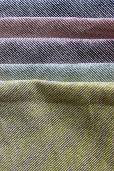
Lianne Polinder's Technomimicry collection is made up of four graphic textiles developed with weaving studio Gaudium BV, designed to "explore the relationship between technology, ornament and function".
"The use of digital and electrical devices and systems has become part of the fabric of our lives. Yet most technology is distant and alien to us," said the project statement at the Design Academy Eindhoven exhibition.
Polinder's aim was to make technology more tangible, in the hope that it might be easier to understand in a form that can be touched.
"Technology shapes our world and we become increasingly inseparable from it, while most of us consider ourselves outsiders with no say in the matter," said Polinder. "That does not seem right to me. If something is a major force in our lives, we should be able to 'touch it' rather than be at its mercy."
Her first cloth features a pattern based on the arrangement of pixels that form pictures on LCD (liquid-crystal display) screens, like those used for flat-panel displays.
The designer enlarged the composition and turned it into a woven graphic, so the nature of how pixels work can be better understood.
Stripes of red, blue and green – the colours that make up the RGB colour model used to create digital colour images – run vertically down the fabric, broken up by thin horizontal black lines.
On an LCD screen, the brightness of these coloured elements within each pixel is altered to form the picture interpreted by the eye.
The designer used the textile to create a floor-length skirt, which was displayed in front of a length of the fabric at the exhibition during Dutch Design Week earlier this month.
Polinder's other three textiles are woven to mimic the photovoltaic cells that cover solar panels, used to convert energy from the sun into electricity.
Blue rectangles with chamfered corners are separated by a grid of white lines, further divided by thinner lines that vary across the three designs.
Photovoltaic cells are used in grids across large panels in order to generate enough energy to be useful, which Polinder demonstrates with the pattern.
"The fabric LCD Cloth is woven in a satin binding which makes it relatively supple and suitable for curtains and the like," explained the designer. "The Solar Fabrics are double weaves in white and blues: sturdy, and more suitable for upholstery or bags."
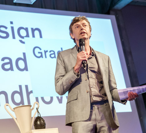
News: technology and food have replaced products and furniture as the new frontiers for designers, according to Thomas Widdershoven, creative director of Design Academy Eindhoven (+ interview).
Young designers today want to make a difference in the world and are moving away from the ego-centric creations of the previous generation, Widdershoven said in an interview with Dezeen during Dutch Design Week in Eindhoven.
By contrast the idea of designing products or one-off creations for galleries is "not as avant-garde and pioneering anymore," said Widdershoven, who joined the highly influential Dutch design school in March last year following a turbulent period of in-fighting and resignations at the academy.
"At the moment the idea that we are product designers, or that we create collectables in a sort of gallery or cultural field, is shrinking very fast," said Widdershoven, a graphic designer who co-founded Amsterdam studio Thonik.
"I see students much more focused on the world at large, not so much only on the cultural sector,' he said. "And I see them addressing real-world issues. They really want to make a difference in the world."
Widdershoven said he wanted to make technology a core element at the academy, which until now has focused on craft skills.
Thomas Widdershoven speaking at the Design Academy Eindhoven graduation show
"The Design Academy needs to get a new grip on technology," he said. "The studios at the academy are more places for craft. But technology is not so strong in our academy."
"Before, technology was really something for industry, and now we're getting into a place where technology can be for people," he added. "The individual, the designer, can make a difference."
Widdershoven is forging links with technical universities in the Netherlands and has curated an exhibition at the Van Abbemuseum in Eindhoven exploring the difference between the way designers and engineers think.
The Sense Nonsense exhibition compares the approach of designers to that of engineers and responds to a recent critique by Dutch writer Timo de Rijk, who argued that Dutch designers were narcissistic and the education system was irresponsible.
"If people accuse us of creating nonsense, let's take it up as a positive word because it gives us freedom to think, freedom to act and freedom to make without all of the responsibilities of problem solving," said Widdershoven.
Widdershoven has already introduced a new department at the design academy called Food Non Food, headed by Marije Vogelzang, which encourages students to engage with the food industry.
Widdershoven said that food and technology were "definitely" important new fields for designers to address, along with service design and interaction design.
Here's the transcript of the interview:
Marcus Fairs: You became creative director of Design Academy Eindhoven in March last year. Tell us about the changes have you made at the academy and what your vision is for creative education.
Thomas Widdershoven: Can we make the question a bit smaller and start by talking about the two exhibitions I've curated in the Van Abbemusem. They reveal a lot about my position.
Marcus Fairs: Okay, start by telling me about Self Unself, the exhibition you curated at the museum during Dutch Design Week last year. That explored the contrast between the way designers today work both on self-initiated projects - which could be accused of being selfish and even useless - and on functional projects with real-world applications.
Thomas Widdershoven: Basically I think that at the moment the idea that we are product designers, or that we create collectables in a sort of gallery or cultural field, is shrinking very fast. That whole market is shrinking very fast. So I see students much more focused on the world at large, not so much only on the cultural sector. And I see them addressing real-world issues. They really want to make a difference in the world.
But despite that we still educate students to be individuals that have a real impact on the process. So even if they don't make products, they will be acting in situations where the individual makes a difference. That is what our educational system focuses on. So we pick students with talent, with motivation, and with personality.
And we try to develop them over those four years [of the degree programme] or those two years [of the masters programme]. Now the self is quite important, but the students have to be open to the world, they try to share things with the world, they try solve problems in the world. That made me think of the world "unself" as an opposition.
So you can make an axis of self to unself and somewhere along that line our students position themselves as designers. Because even if they go to extreme unselfish positions, they are still going to function in a situation where the individual makes a difference.
So if [Design Academy Eindhoven graduate] Dave Hakkens gives his project [Phonebloks concept for a modular mobile phone] to the world as an open-source project, without an economic model, he is challenging existing economic models and acting unselfishly. But it is still Dave Hakkens the individual designer doing it. There will always be a moment where his personality is part of the whole discussion.
When positioning yourself along this axis of self and unself, I think it's quite fair to say that we are also talking about the relationship between design and art. Art is much more self-conscious, self-initiated, but also solipsistic. Design is much more open to the world.
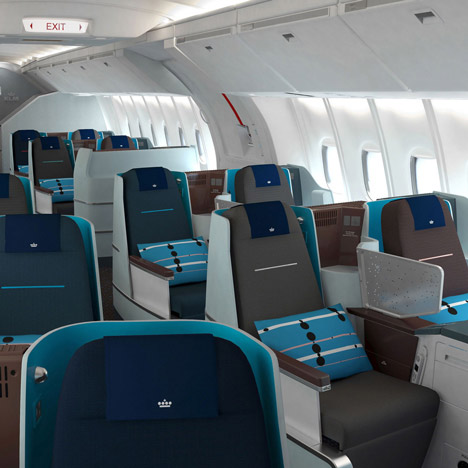
So that is why we did this research on self and unself in a museum, the Van Abbemuseum, because that is where you find art and where you can also find design. So we tried to show projects where designers and artists take a position between self and unself. We included work from designers who are obviously a little bit older, who have a strong personality, and have a personal fame - like Hella Jongerius. From her we chose the KLM project.
For that project Hella was initially only asked to design the business-class interior. In the business-class interior you need the autograph of a famous designer and then there is quite a bit of freedom for that designer because it has to look designed. But later she was asked to do the economy class. And that means that she really understood something about KLM because in economy class, her name will not make a difference. So it really has to be a design that a large group can understand and that KLM can understand.
She changed the colour palette of KLM. And colour is the most important identifier for them. She moved away from the blue because she thought that the whole atmosphere should be a lot warmer, and went into aubergine colours, browns and purples.
So for me it's very interesting that a strong designer who gets a lot of freedom makes something that the client can understand, that is really functional for them, but yet challenges the way they are. So there is a strong relationship between the client and the designer. It's a little bit of a battle I'm sure. I checked with Hellaand she agrees. So it was quite a fierce thing. So even in her practice I see this axis of self and unself and that she is moving up and down it.
Marcus Fairs: What about this year’s exhibition?
Thomas Widdershoven: This year I thought that the Design Academy needs to get a new grip on technology. The studios at the academy are more places for craft. We do wood, we do metal, we do ceramics and fabric. But technology is not so strong in our academy. I think in this day and age technology is really having a great, great impact on our lives. And I think that the Design Academy Eindhoven way of thinking could help there. If we want to address that, then we need to consider the more serious design side: industrial design. Also I hear people like [curator and critic] Timo de Rijk criticising us for being irresponsible, saying that we're narcissistic and even that we're dangerous.
Marcus Fairs: Timo de Rijk wrote an article in the Dutch newspaper NRC Handeslblad attacking design education in the Netherlands of being irresponsible because it produces students that are more interested in expressing themselves than solving problems in the real world. Tell us more about that.
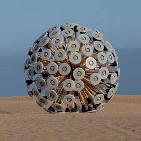
Thomas Widdershoven: He wrote an article on the Mine Kafon [a wind-blown device for clearing mines designed by Design Academy graudate Massoud Hassani]. His argument was that the Mine Kafon, which looks like a dandelion blown by the wind, does explode mines but it doesn't, of course, make a minefield safe. To me that's so obvious that I don't think anybody is going to step into a minefield where the Mine Kafon has been. But Timo argued that people might think it's safe and that it's bad that it was bought by MoMA and not by the military.
And I argue there that first of all the military will never buy anything to help civilians but only to help themselves. So in that sense he does not have a good view on society. But also the Mine Kafon does explode mines. It's not only about awareness. There are mechanics involved, it is functional, it just doesn't completely clear the minefield. But it is functional. And in that sense it is a step towards maybe another way of clearing mines. It's a step in-between.
One of the first things I did when I joined the academy was to invite Timo in to have a student debate about what he meant when he said that we were being irresponsible. I walked away from the debate thinking that my main point is that Mine Kafon makes sense. While Timo is saying we make nonsense. So if I just say "Hey, I like making nonsense!" then I'm not responsible; I'm free.
In this way if people accuse us of creating nonsense, let's take it up as a positive word because it gives us freedom to think, freedom to act and freedom to make without all of the responsibilities of problem solving. So let's say: "Yes, we make nonsense!" and let's say to the engineers: "Yes, you make sense!" and see if we can connect.
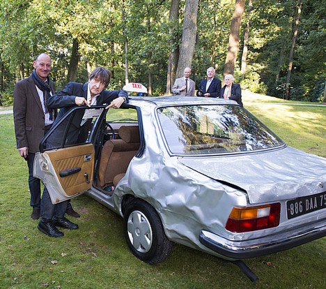
But then of course, if you start thinking about nonsense, what we put in this show [at the Van Abbemuseum] is a dented car [Le Taxi cabossé] by Wim T. Schippers. He was asked to do an art project with a new car so he smashed it up. The client, Renault, wanted a sort of signature on the car, or an arty painting on the car, but he smashed up the outside of the car.
He wrote a little text saying it looks like a dented car, but actually it's very handy because when you come out of the showroom, the first metre you drive will drop the price of your car immensely, and the first dent will be something you're totally afraid of. But if the car comes pre-dented you don't have that problem. So actually it's a problem-solving car. So here you have a car that really makes you laugh if you see it, but it's actually solving a problem.
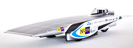
Then we included the Nuna5 solar car, which is made to go as fast as it can on as little energy as possible. It looks really avant-garde and innovative, but basically it uses old techniques - solar cells and aerodynamics. So it's as flat as possible to take as much sunlight as possible. That's the thinking behind it. So it looks really innovative, but it is actually not and it also strips back all the necessary functions of a regular car.
Because normally people can sit in a car and there is some space for luggage. In the Nuna5 a man can barely fit in, and only exists to serve the car. The car's only purpose is to enter a race. So it's a challenge, which is already, of course, a world of nonsense.
Slow Car by Studio Makkink & Bey
Then the third car is by Studio Makkink & Bey. They made a very clumsy and slow car, which looks like nothing but nonsense until you really start to think about it. It only drives at 30 km/h, which is the average speed that we drive. The point is if a car can’t go faster you're not in a hurry, you're not stressed and you have so much time left. And you can actually work and have mobility in the same place. Jurgen’s vehicle merges domains: work and mobility.
Now that is real innovation. So although it looks clumsy it is probably the most sensible of the three cars. So in the solar car we have a little bit of nonsense in sense. In the pre-dented car there's quite a bit of sense in the nonsense. And then the real innovation lies with Jurgen where domains meet. There you have sense in nonsense. In this respect I think that we are having a whole new dialogue about how different fields can cooperate.
I made one mistake though [laughs]. Last year I invited all of the artists and designers to the museum to see the Self Unself exhibition. And they came running in because they love that platform, they love that place, they love to have that interaction. And this year I invited all of the engineers to the museum. But the engineers don't give a shit (chuckles). It's not their place.
So I think the axis of sense/nonsense is a good way to start talking with engineers about where we stand and how we can work together. Putting it in a museum is a really good way of experiencing it, but it's not the right way of getting the dialogue started with engineers because it's not their domain. So we have to find a new common language where we can work together.
Marcus Fairs: And how does that feed back into what you were saying about the academy and needing to engage with technology more? Is the Sense Nonsense exhibition a research project that will feed back into the school?
Thomas Widdershoven: Yep, that's exactly the whole point.
Marcus Fairs: And so what have you learned? Do you know how you'll integrate technology into the academy?
Thomas Widdershoven: Well, what I did learn is that, while it was so easy to talk about art and design in the museum, I did learn that we can make a great presentation and think about the engineers and designers, but that we have to find another platform to work together. So now I'm directly contacting the Technical University Delft and seeing if we can find a common language and work together.
Marcus Fairs: This year for the first time the technical universities are taking an active part in Dutch Design Week alongside the design schools.
Thomas Widdershoven: They are here, and actually I was sitting here with them at a table only ten minutes ago. So yeah we will start this conversation. It will be the next thing for the coming year. Because Eindhoven is of course a very technologically advanced city, and it has design, and it has the Design Academy, which is quite an out-of-the-ordinary part of design. We don't aim to be practical. We're more poetic. I don't want to use the word "creative" because that's old school. We're just more… "out-of-the-box," which is also a horrible term. Marcus, help me here! What's a nice English word for what I mean [laughs]?
Marcus Fairs: Okay, so you're going to make a formal bridge between the Academy and the technical universities, is that what you're saying?
Thomas Widdershoven: Well, there are some links already and we're going to strengthen those and also build more. Because now we only have links to the readership and we also want to have links to the bachelor and master's programs. And then we just have to see how we can work together, with a university that is very strong in interaction design and technology while we are stronger in concepts and a personal approach to design.
Marcus Fairs: And why do you need to bring those two things together? Why do you need to integrate technology into the academy? You get a lot of good students, a lot of good press. What is the need for technology?
Thomas Widdershoven: The thing is that, for me, I really have a feeling that technology can be effective, for the first time, on a smaller scale. Before, technology was really something for industry, and now we're getting into a place where technology can be for people. The individual, the designer, can make a difference. And for the first time in history, that is possible with technology. It was possible before, when people were pioneering to make the first cars, which were made in small workshops.
Now, of course, making a car is such an immense, such an intense undertaking that's it's impossible for one person to make a difference in that process. But I see a lot of technology at the moment being smaller, and you have, of course, 3D printing but also programming and also apps. It's all done by small groups in small places. And there, our designers, with their mentality, their upbringing, and their education, can make a difference.
Marcus Fairs: How will you integrate it into the academy? The departments of the academy are based around not professional disciplines, but areas of life. How would technology fit into that structure?
Thomas Widdershoven: We did make some changes already. Okay, so in the bachelors programme we have eight departments. Last year Tonny Holtrust, the director of education, and myself, the creative director, made changes. We merged two departments - because we are only a school of several hundred. So we don't want more departments. A group of eight heads is a really nice group to talk with about the whole field of design. So we decided to merge two departments to create space for another new department.
We merged Public Space and Living and we called it Public Private and we started Food Non Food. For me it's very important that we're not a cooking school. So it's really about processes in the food industry that are becoming bigger and bigger in scale, and at the same time it's also downsizing. Downsizing seems very familiar for us, and probably we will be doing most of the stuff on a small scale. But we attracted Marije Vogelzang as the new head, and she's also involved with big industry. So she's also trying to change the industry. That's exactly the same as Hella Jongerius. She wants to change big industry to make it more personal and to make it more human.
So my hope is that Food Non Food will bring us into processes that are so important in such a fundamental field of life as food.
Then, as technology is so important, it would be extremely interesting if we could have a whole department devoted to it. We've always had food in the departments. We also already have technology in the departments. So it's not that it's not there, but if it is possible to have its own new department, that would be great.
But we would also need to find a head that can really stand for that, which is of course one of the most important and difficult tasks. Finding Marije, who is really an internationally renowned designer with a whole field attached to her, as head of Food Non Food was for us a big success.
And knowing how difficult it is to find the right person for the right position I'm not sure that we will have a head of technology and a new department of technology or whatever it will be called soon, but it would be great if it were possible.
Marcus Fairs: Is there any other design school - or non-design school, to use your terminology - in the world that is a role model that is already doing this, or is something you feel the academy can initiate?
Thomas Widdershoven: I think I still have to visit all of my colleagues, but I think technology is a bit more incorporated already at the Royal College of Art [in London] and ECAL[in Lausanne]than it is in our place. So I'm hoping to visit those schools in the near future. And then of course you have MIT.
Marcus Fairs: You said right at the beginning of the interview that the phenomenon of designers making objects for galleries is declining. Why is that?
Thomas Widdershoven: It's simply declining because it's not as avant-garde and pioneering anymore. This idea that design could be interesting in itself as a cultural product is something that happened at a certain point and then it attracted a lot of new energy, and then at some point it became established. And then it attracted a little less energy. So it's just in the natural course of things.
For me it's not dramatic. I still see a lot of students making really beautiful stuff that I think: "Oh! That will be in Milan next year." And I'm really happy to see it. It's not that the quality is less. The quality is not less. But the moment of discovering a new field of design is not there anymore. This is an old field. And that is where it loses a little bit of attention and energy.
Marcus Fairs: And the new fields are food and technology?
Thomas Widdershoven: Yeah, but also services and interactions. Definitely.
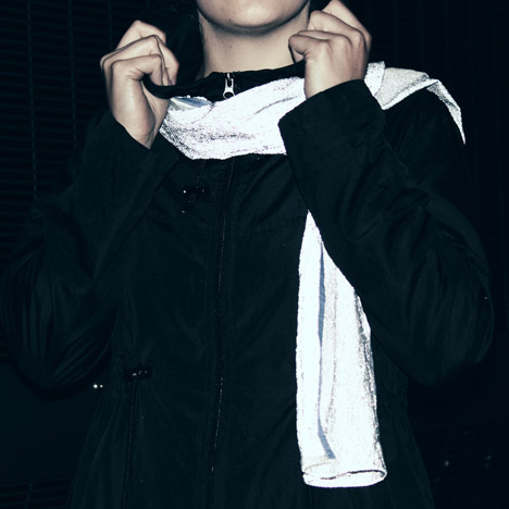
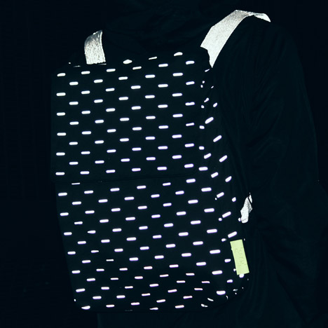
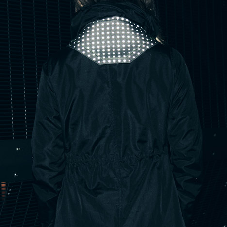
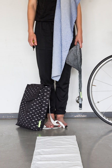
Dutch Design Week 2014: retro-reflective thread is woven into a range of fabrics by Marlies Schets to create a line of accessories that reflect light at night, turning them into cycling safety garments.
The collection, which includes a scarf and backpack, has been designed to have the same light-reflective properties as typical high-visibility clothing by night, but appear relatively inconspicuous during the day.
Schets wanted to create a range of attractive items to try and overcome the reluctance of night-time cyclists and pedestrians to wear the standard "shapeless" neon vest with reflective strips that is widely available as a safety garment.
"I noticed that not many people like to wear the neon jacket during their casual ride or walk with the dog because the jacket is shapeless and way too obvious, which is not always necessary during daytime," Schets told Dezeen.
The fabric is woven from two colours of cotton yarn and a synthetic yarn that can only be detected when it is illuminated by passing light sources at night.
This thread is described as retro-reflective as it reflects light back towards its source when it hits the surface of the fabric, rather than in all directions.
"[The items] all look fairly normal during the day, but at night they glow under the luminescence of artificial light," said Schets. "The impact on the wearer is that he or she will be safer, without wearing something they might not like."
A scarf made from a length of the woven fabric comes in a range of pastel hues, while a black backpack has luminous straps and a series of small ellipses in an outer layer that reveals patches of fabric that light up in the dark.
"What I'm trying to do is reduce the gap between wearing nothing and wearing a neon jacket by integrating reflective materials into daily used products," Schets said.
The products were exhibited at the Design Academy Eindhoven graduate show during Dutch Design Week earlier this month. The designer is also in the process of developing a water-resistant bike lock that will be made completely from synthetic yarns.
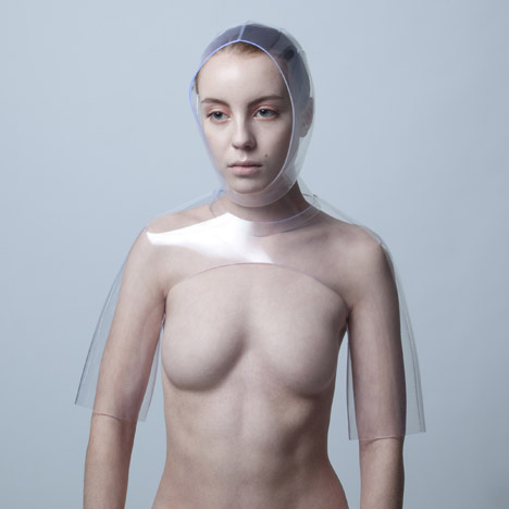
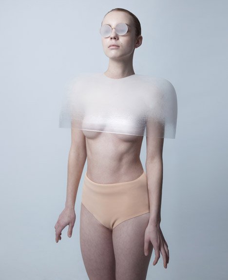
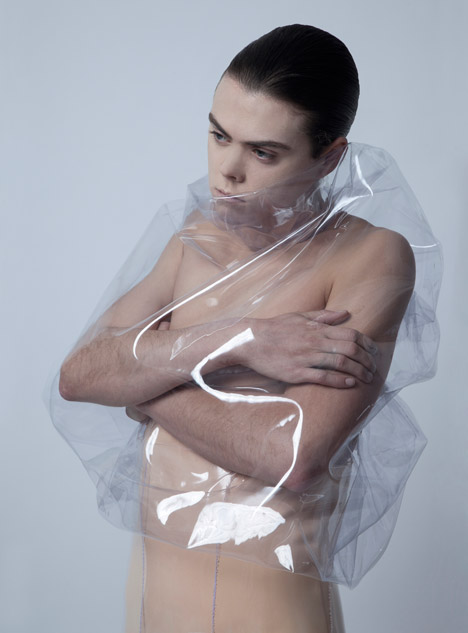
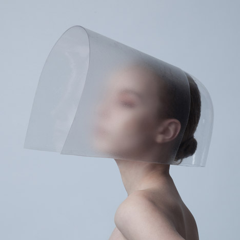
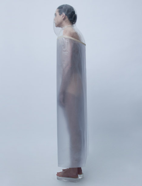
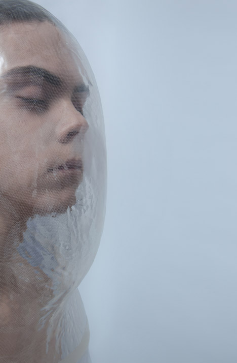
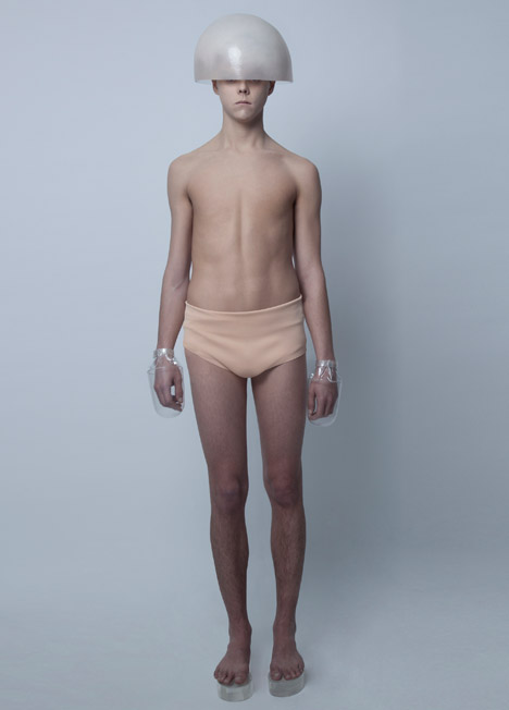
Dutch Design Week 2014: graduate designer Anne van Galen has created this series of protective headgear and accessories for inhabitants of a fictional world caught in a constant torrential downpour.
For her Design Academy Eindhoven graduate project, Anne van Galen imagined a scenario in which is never stops raining and designed a range of apparel to suit the climate.
"Imagine we would live in a world with endless rainfall," said the Dutch designer. "When time evolves, so will our shape and posture. In my vision, I celebrate the rain, in which fashion becomes naked, transparent and layered with thin diluted colours."
She watched the behaviour of people in adverse weather conditions to gauge how our species might change if we lived in a perpetual downpour.
"I was fascinated by the behaviour of people in the rain," Van Galen told Dezeen. "How they move, react and function. I spent hours just looking at people in the rain."
Her Warriors of Downpour City, as the project is titled, have evolved a different posture and a restricted movement range from huddling in the cold, wet environment.
The garments and accessories that Van Galen created for these fictitious characters to wear are formed from silicone, used in a variety of stiffnesses and opacities.
"For the hard shaped pieces I made moulds and added layers of plastics," she said. "Some of them are reworked to make gradients from translucent to dusty."
The lightweight pieces are cut from patterns, then assembled and kept in shape using nylon threads.
Domed or curved pieces sit over the head and shoulders to deflect water away from the body, and platform sandals raise the feet above puddles.
A crinkled see-through covering for the torso is designed with enough space for arms folded across the chest.
Another clothing item engulfs the whole body, with a transparent bubble surrounding the head from which a foggy cylindrical coat without armholes descends down to the ankles.
The eight photographs demonstrating the collection were displayed at the Design Academy Eindhoven graduation show, which took place during Dutch Design Week last month.
Dutch Design Week 2014:Design Academy Eindhoven graduate Merel Witteman has created a photo series that includes images of stepping in poo and a dead rodent skewered on a fork to explore our fascination with being disgusted.
Merel Witteman's Aversive Aesthetics project features a series of images produced to provoke feelings of revulsion in the viewer.
They include a foot that has just trodden in faeces, a mouse impaled on a cooking utensil, snails creeping up the sides of a tea cup, a used sanitary towel in a pair of underwear, red liquid smeared across a woman's crotch and a finger stuck through the hole of a sticky doughnut.
Witteman created the images to comment on the fact that many people are drawn to, and are interested in, stimuli that cause them to feel disgusted.
"Aversion has a paradoxical effect: as much as we want to run away from disgusting things, we feel attracted to them as well," said Witteman.
"There is something so tantalising in the shock that we watch movies we don't want to see, sniff at things we don't want to smell and listen to stories we don't want to hear."
The images – created for her Design Academy Eindhoven graduate project – each features a slogan that tries to give a reason for the phenomenon.
"Beauty makes you look once. Disgust makes you look twice" and "Sadness brings tears. Disgust brings stories" are two examples, which evolved from Witteman's research and aim to explain the lure of such imagery in simple terms.
Witteman's research, which she has compiled into a series of books, explores how these types of aesthetics could influence the way graphics and objects are presented in the future. She asks the question: "Can disgust function as an aesthetic value?"
"The role of the designer is changing, instead of making beautiful products we are telling more and more stories," she said. "But in the way we present our stories we still use the rules of the clean and the beautiful."
"I thought that with this new role it could be interesting to look into other, unconventional ways of telling a story, and in this way enhance the experience of the public. I took a deeper look into my personal fascination: the emotion of disgust."
The photo series was on display at the Design Academy Eindhoven exhibition during last month's Dutch Design Week.
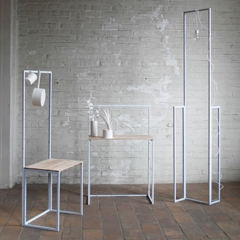
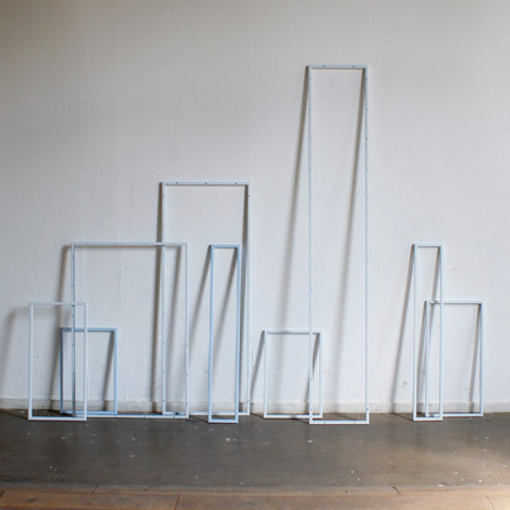
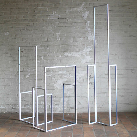
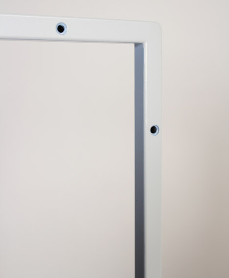
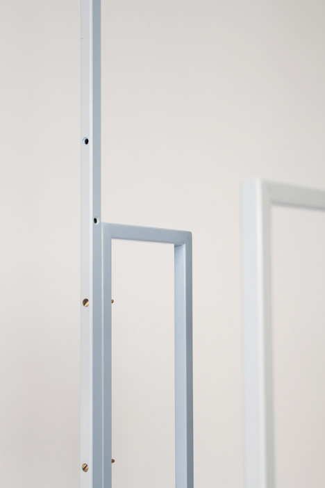
Taipei designer Fabricia Chang's Flexible Order project contains a series of forms assembled from welded stainless-steel square tubes that can be combined in different configurations.
Holes along the sides of a set of different-sized frames correspond so the rectangular pieces can be bolted together and stand independently.
To adapt the frames for different uses, wooden boards and hooks can be added to the steel sections, which are available in shades of pastel blue.
"[Flexible Order] enables users to create their own order within a given order," said the designer. "With this system, a new relationship between freedom and order is achieved."
As a foreigner living in the Netherlands, Chang became intrigued by the fact that people conform to similar architectural styles in accordance with planning regulations regardless of their personal taste, resulting in a uniformity and order that to her seemed uniquely Dutch.
"This project is an interpretation from a foreigner's point of view, by observing the order in Dutch society that the Dutch take for granted, and expressing it in a micro scale," said Chang.
In response, she developed the modular furniture system that could perform various functions and be arranged by each user individually.
"Order can be seen as the combination of proportion, repetition and symmetry. We see rhythm countless times in our daily life and the repetitive movements create the rhythm."
Chang graduated from the Man and Leisure Department of Design Academy Eindhoven in 2013 and is now based in the Netherlands. Flexible Order was shortlisted for the Make Me! Competition as part of the Lodz Design Festival in October.
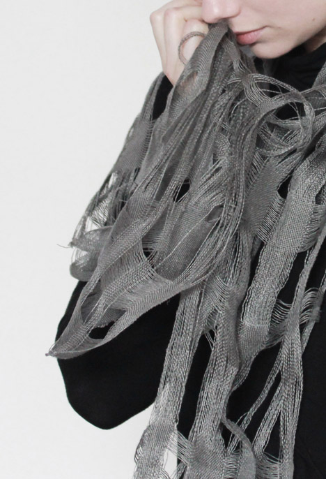
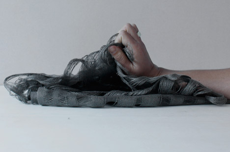
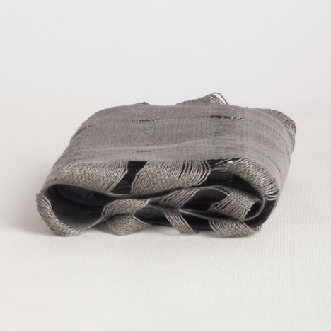
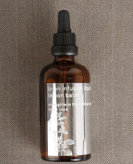
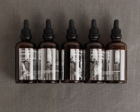
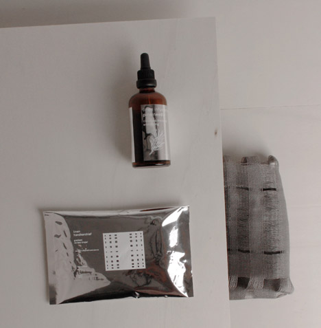
Combining Alexandra Stück's aromatic liquids with water and handwoven linen fixes the therapeutic scents into the linen for up to six months, to be released by body warmth, touch or movement whenever the fabric is used.
Inspired by the alternative therapies developed by 19th century German monk Sebastian Kneipp, Stück worked with five scents that are claimed to have certain health benefits: germanium and valerian root to provide comfort and strength after psychological trauma, lemon balm to balance the cardiac cycle, peppermint to promote concentration and focus, pine for blood pressure and rosemary to restore libido and sexual function.
"The scent molecules reach your olfactory organ and create a certain instruction in the brain, like, decrease stress, increase concentration, lower blood pressure, balance the cardiac cycle, depending on each plant and its remedies," Stück told Dezeen.
Taking the essential oils from each plant, she developed a liquid "scent dye" that can be hand-washed into natural linen and fixed for up to six months by ironing the fabric.
"The textiles were designed with an open weave that allows the scent to diffuse to your nose," said the designer. "The textiles are organic linens so they're not coated or chemically processed. I rubbed them to make them shiny and have a nice finish, but I didn't use any chemicals, so they still have the ability to open up in warm water – something linen does naturally. Both the scents and the fabric originate from plants so they work together."
Keen to find a contemporary application for these ancient remedies, Stück designed the textiles to be used as scarves, handkerchiefs, bed linen, towels and other interior products.
"The ingredients are 100 per cent natural," she said. "Artificial scents used by the detergent industry cause allergies and create hypersensitivities on our skin."
Stück also developed a linen Body Sports Patch, which releases the fragrance of German pine forests in response to body heat to connect users exercising in cities and gyms with nature.
"You can wear it when you're running in an urban environment, but seeking nature, when you want to be in your bubble and add another layer to your sporting experience," said Stück.
The Herbal Kneipp Textiles project was presented during Dutch Design Week, as part of the Design Academy Eindhoven Graduation Show, where Stück has recently completed a bachelors degree in the Man and Wellbeing department.
Design Academy Eindhoven graduate Maxime Mellot has integrated a birdcage, a fish tank and a plant pot into this desk to encourage users "to look at natural elements".
Maxime Mellot's steel-frame Turia desk is too high and too small to work on comfortably.
Instead, a clay pot, steel birdcage and glass tank form part of the design to encourage the user to slow down and observe the life inside.
"In a society with a continuous focus on performance and permanent internet connection, pure moments of privacy become rare and precious. How can furniture invite us to take a break and enjoy an 'unconnected' moment?" asked the designer.
"The idea is really to switch the focus from 'I am very active, Facebooking, networking and so on' to 'I chose to have birds in a cage, so now I have to take care of them'," Mellot told Dezeen.
The wire cage is positioned over a circular indent in one corner of the oak tabletop. One of the legs appears to extend through the surface and branch to create a perch for small birds.
A tank for fish is positioned so the water level sits flush with the work surface. The bottom of the tank balances on a cross brace between two legs.
The clay pot for a small plant is partly submerged in the water, with the greenery overspilling the sides.
"By integrating iconic items such as a birdcage and fish tank in the tabletop, the focus almost automatically shifts from the obligatory 'to-do-list' to a pleasant pondering of nature," said Mellot.
"As the fish nibble on the roots of the plant under water, the birds sing next to you while having a cup of tea or a snack."
Mellot had the idea for the project while living in Valencia. "The name Turia is a tribute to Valencia's huge park, that connects the city centre and the seaside," he explained.
"I noticed how influenced I was by living so close to a peaceful and slow place like this. So, this project is about admiring slowness, and a way to achieve that is to look at natural elements, because you have no control over them."
The project is currently a prototype and intended partly as critical design, but equally as something that could go into production.
The Turia table was on show during Dutch Design Week as part of the Design Academy Eindhoven graduate show, where Mellot has just graduated from the Man and Activity Department.
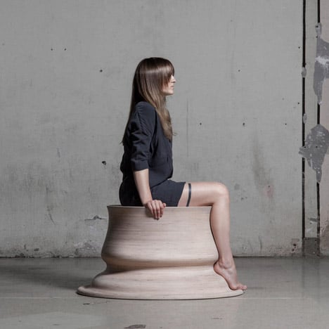
Lithuanian designer Marija Puipaitė used the curves of her legs in different resting positions to generate the forms of these seats created for her Design Academy Eindhoven graduate project.
Embracing Touch is a collection of three seats formed around the silhouette of Marija Puipaitė's legs.
In each case, the designer took the profile of the backs of her legs and the space between the floor, and extruded the section around 360 degrees to create a solid shape.
The resulting furniture pieces fit perfectly to her body when seated, whichever direction she is facing.
"It's a collection of sculptural seats. It's also a method of creating shapes using the body," Puipaitė told Dezeen. "These objects could be customised and function as an abstract monument for a certain person in a personal or public space."
Driven by a desire to experiment with materials and processes, Puipaitė made each design using different material combinations.
The first seat is formed using birch plywood shaped with Computer Numerically Controlled (CNC) machinery, and the second from plaster, sand and silicone set in a running mould.
She created the third by spinning wool over a medium-density fibreboard (MDF) structure and applying resin at the end.
The project is intended partly as a commentary on how much of themselves designers leave in the things they design.
"I hope people will relate to the idea that there is a lot of personality and intimacy behind every design and art object. The creators leave their essence in their works," said Puipaitė.
"Within my works I would like to arouse ideas about physicality, how it affects us, what we think and how we appreciate our own and other people's bodies."
Embracing Touch was presented during Dutch Design Week 2014 as part of the graduate show at Design Academy Eindhoven, from which Puipaitė graduated with a master's degree in Contextual Design.
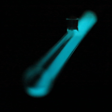
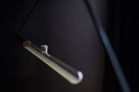
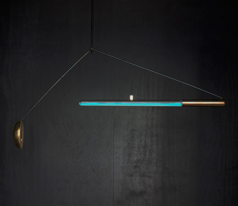
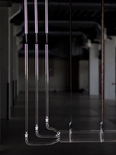
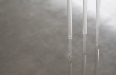
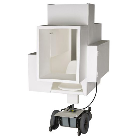
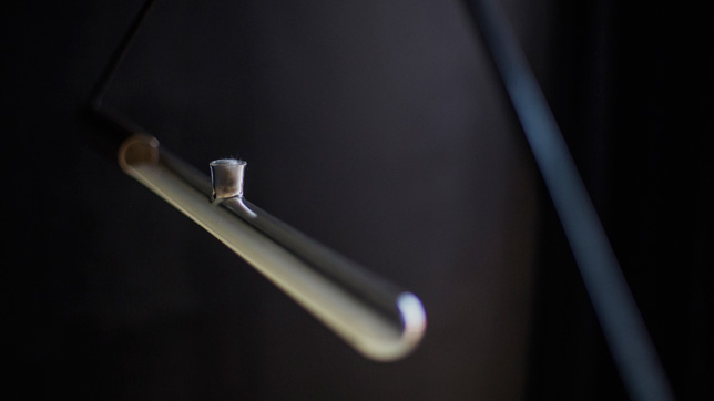
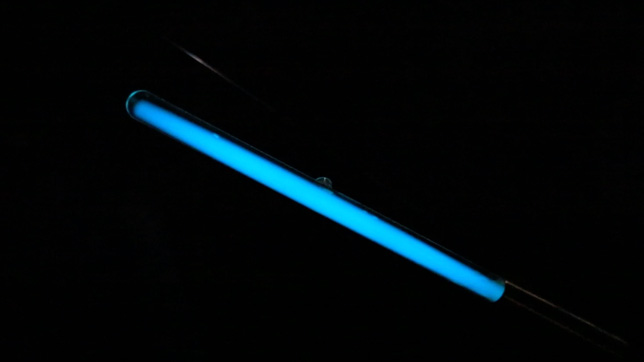
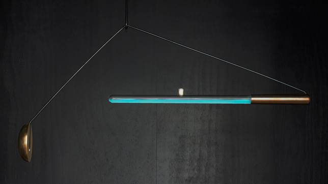
Van Dongen's Ambio lamp, which was her graduation project at Design Academy Eindhoven, consists of a glass tube filled with bioluminescent bacteria in a saltwater solution.
"Ambio is a lamp that works with bioluminescent bacteria that are usually found on the skin of an octopus," says van Dongen in the movie, which was filmed at the Sense Nonsense exhibition at the Van Abbemuseum during Dutch Design Week.
"We isolate the bacteria, grow it and place it in an artificial seawater medium with the right nutrients and food."
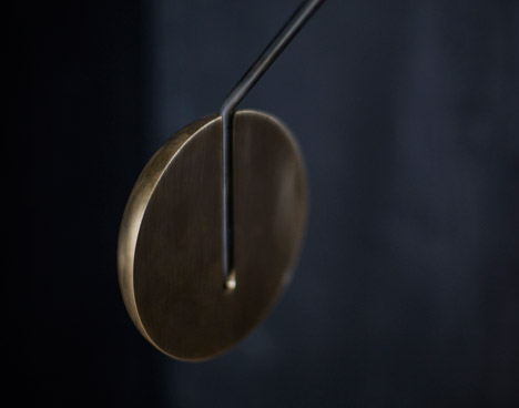
The lamp is suspended with the glass tube at one end and a counterbalancing weight at the other. When it is gently rocked the liquid in the tube is mixed with oxygen, causing the bacteria to glow.
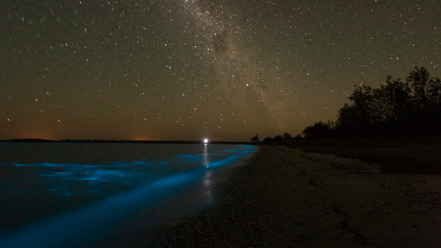
Bioluminescent bacteria in the sea
"You might know the phenomenon of these bacteria from the sea," van Dongen says. "Whenever a wave turns, oxygen is mixed with the waves and these bacteria react to oxygen."
"At the laboratory we are researching how to keep the population alive for a longer period of time," she says. "Right now in the scientific set-up that we have [the bacteria] have survived for three weeks."
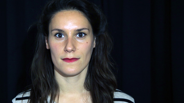
Teresa van Dongen
Van Dongen admits that Ambio is not currently a practical light source that could be used in everyday life. However, she believes the project demonstrates the potential of harnessing bioluminescent organisms to create light more sustainably.
"We are all looking for new ways of creating energy and light and [Ambio] is the start of something," she explains. "I'm not saying this is already a lamp to read a book by, but maybe if it is developed further it can lead somewhere."
Dezeen and MINI Frontiers is a year-long collaboration with MINI exploring how design and technology are coming together to shape the future.
The music in the movie is a track called Family Music by Eindhoven-based hip hop producer Y'Skid.
Design Academy Eindhoven graduate Penny Webb has developed a lamp, a mirror and a textile that fluctuate in hue when subjected to different stimuli, even if they occur many miles away (+ movies).
The objects in Penny Webb's Separate Togetherness collection are designed to interact with each other, helping people anywhere in the world stay in touch without necessarily having to communicate directly.
Each home accessory is paired with a corresponding sensor embedded into a small object in a separate location, connected via Wi-Fi.
When someone stimulates the sensor by breathing, stroking or moving past it, its partner product reacts by changing colour – reminding the owner of the other person.
"On its own, the internet is a relatively lonely place void of human contact," said Webb. "The products each interact, and aim to engage your peripheral awareness as an alternative means of attaining distant closeness."
A hanging ring lamp – made from polyurethane resin mixed with phosphorescent pigment and small ultraviolet (UV) LEDs – glows in response to changes in lighting detected by a secondary object consisting of a light sensor and wireless Arduino, a customisable micro-computer.
Screen-printed onto fabric, a circular pattern of thermochromic pigment reveals layers of colours in response to a touch pad consisting of piezoelectric elements, which detects pressure when it is stroked.
Finally, a thermochromic mirror cast in epoxy resin on a copper plate changes colour in response to a distant breath detected on a third remote object.
"I wanted to escape as much as possible from what we perceive as 'technological objects' so I used combinations of smart materials to create the changing effect," said the designer.
The products share a palette of pastel shades and a common circular form. The phosphorescent pendant lamp is a horizontal loop, the fabric is a large sheet with a circle in the centre, and the mirror is a wall-mounted circular surface.
"The products aim to provide a subtle, somewhat subconscious change of appearance over time that communicates a distant presence," Webb said. "Something really important in the project is that it does not become a simulation of someone far away, but simply a suggestive presence."
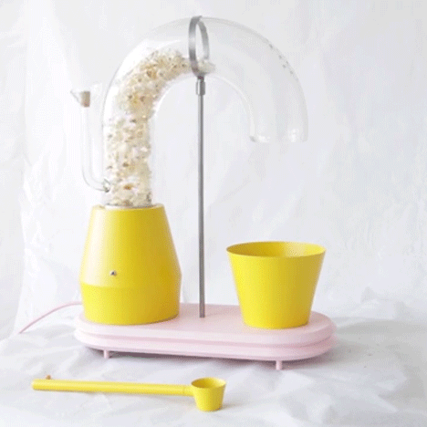
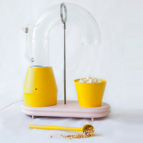
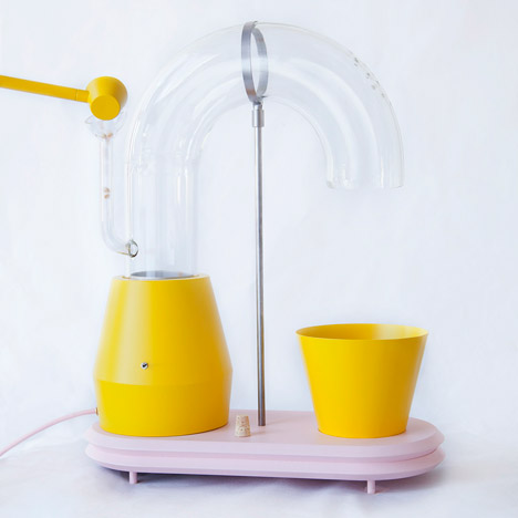
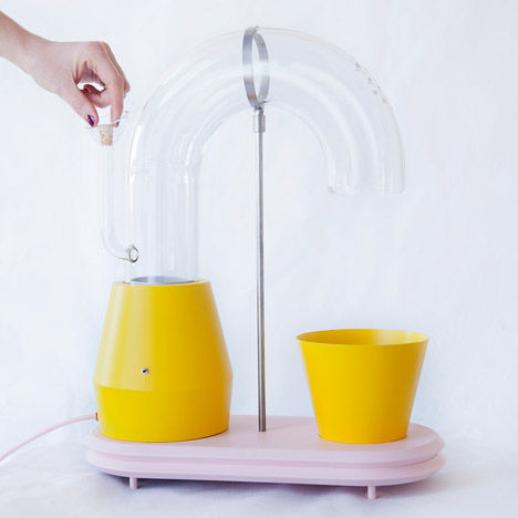
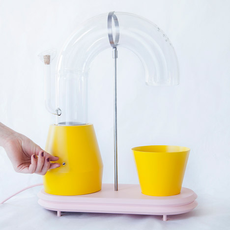
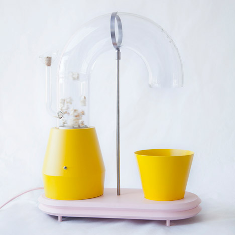
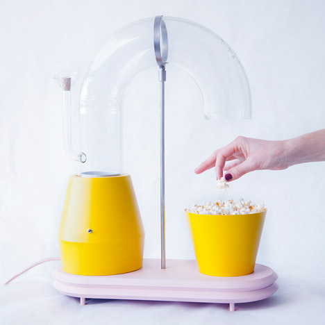
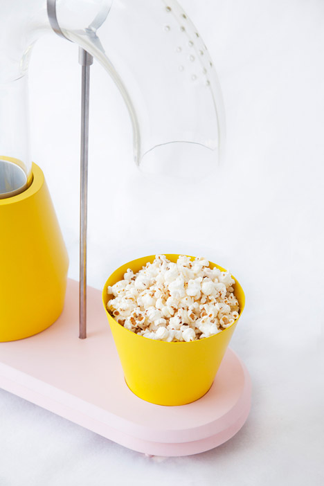
This machine by Dutch designer Jolene Carlier spurts popcorn from the end of a glass tube into a bright yellow bowl when the snack is ready to eat (+ movie).
Popcorn Monsoon is a machine consisting of a pair of conical-shaped yellow bowls set into an oval wooden base – one heats to pop the corn while the other collects it. A curving glass tube fixed to the larger of the two receptacles delivers the popped corn into the smaller bowl.
The popcorn machine is the materialisation of one of 120 colourful drawings created by Jolene Carlier for her final project from Design Academy Eindhoven.
It was also inspired by a quote from the 1971 film Willy Wonka and the Chocolate Factory: "Come with me, and you'll be in a world of pure imagination."
"The drawings with which this project started were made to create a world of pure imagination that still makes sense in this one," Carlier told Dezeen.
"Later on I find a function, one that fits but also surprises," she added, explaining how this process is intended to turn the popular adage "form follows function" on its head.
"Most popcorn machines are very dull though the simple process of making popcorn is exciting."
A small yellow ladle with angled sides is used to scoop kernels into a small glass funnel at one side of the machine.
A cork bung, which gives the apparatus a scientific appearance, blocks this exit route once the corn has been dispensed.
Hot air blown from beneath a grate in one of the two yellow basins pops the corn kernels and forces them up through the curved glass tube. The weight of the glass channel is supported at its crest by a metal hoop and rod affixed to the base.
The ready-to-eat popcorn falls into the second yellow bowl, which sits in a recess at the other end of the wooden stand.
"I considered making the glass tube more extreme or complicated but in the end decided the swirling of the popcorn was exciting enough," said the designer. "When I saw the magic of the floating popcorn it made me so happy."
Carlier has plans to convert further drawings into a range of products that will form a Pure Imagination collection, and is seeking to put the Popcorn Monsoon into production.
Design Academy Eindhoven graduate Eléonore Delisse has created a lamp to counter seasonal affective disorder by displaying different colours at different times of day.
Delisse's Day and Night Light uses different wavelengths of light to create varying colours, intended to help regulate the body's circadian rhythm.
Changes in this rhythm triggered by falling lights level in autumn and winter can cause seasonal affective disorder (SAD) – a cyclic form of depression that affects millions of people every year.
"The ultimate wellbeing is to wake up happy and sleep peacefully at anytime of the year," Delisse told Dezeen. "And yet winter blues play a big role in our mood."
Delisse designed the lamp as her graduate project at Design Academy Eindhoven, in response to what she saw as the lack of considered, design-led solutions for SAD.
"All the existing solutions to SAD focus on the intensity of light," said Delisse. "I was interested to look at this from another perspective. Not only by being only exposed to certain lux levels but by having a coloured rhythm that influences your brain behaviour."
To create the different colours, the LED light source embedded in the lamp's pear-wood body shines through a rotating glass disk. The glass is dichroic, so it displays different colours in changing light conditions or depending on the angle of view.
Suspended on two brass fixings and powered by a motor, the disk rotates to coincide with different times of day, altering the colour of light it reflects.
"Different colours of light affect the body in different ways," said the designer. "The Day and Night Light is a device to understand time differently and regulate our circadian cycle accordingly."
A blue light in the mornings lessens the body's production of the melatonin hormone that stimulates wakefulness, while an amber light in the evenings triggers melatonin production to make the user feel sleepy.
The light source is hidden in the curve of the lamp's body, which is slotted into a block of marble to weigh it down. The flat piece of wood has a half-circle removed so the glass disk can rotate freely.
Delisse has created the lamp in two sizes and orientations.
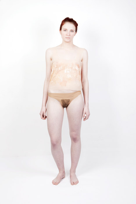
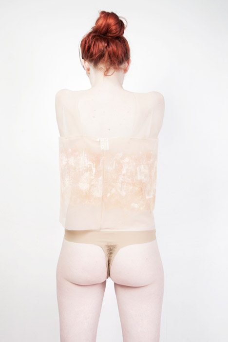
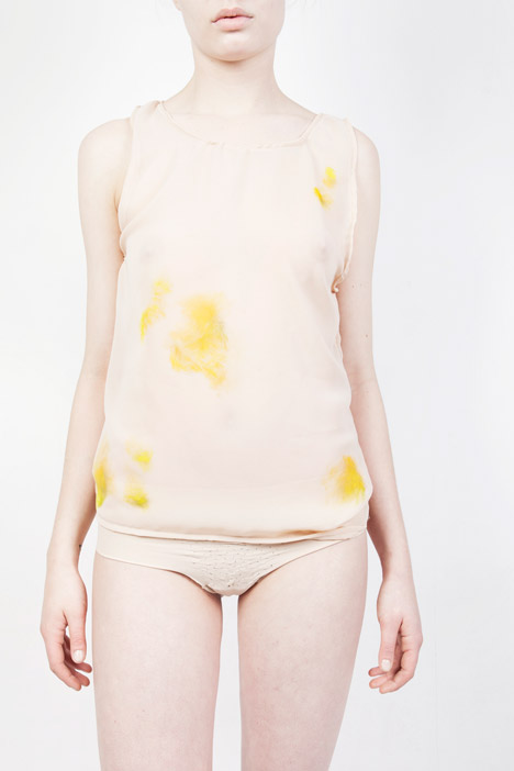
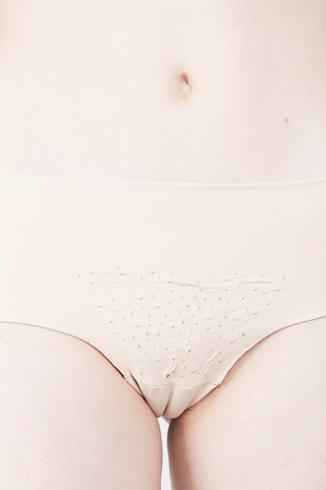
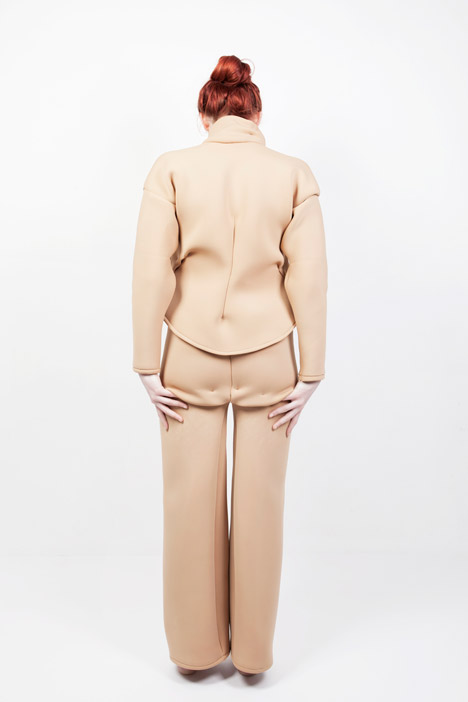
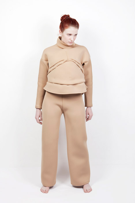
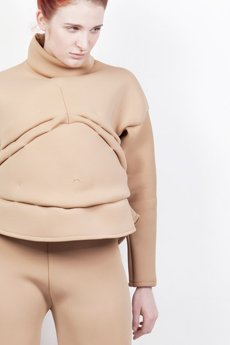
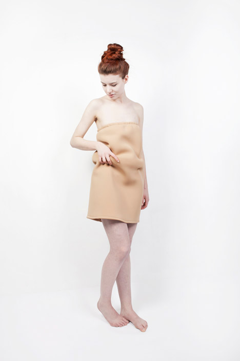
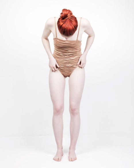
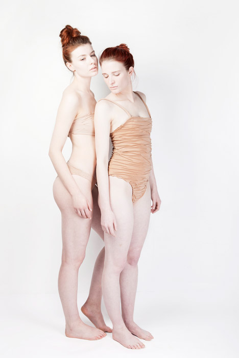
Underwear adorned with artificial pubic hair and a skirt padded to look like love handles feature in this collection of garments by design student Debora Dax.
Dry Skin Shirt and Pubic Hair Panties
Dax's InConTextUre clothes aim to highlight features of the body that people typically want to conceal.
Dry Skin Shirt and Pubic Hair Panties
"This clothing series is inspired by human body textures, which we like to hide and avoid," said Dax. "This project shows that those structures are interesting and can be seen as body decorations."
Bruises Shirt and Stubbles Panties
Differences in physique, skin quality and body hair are all celebrated in her nude-coloured garments.
Stubbles Panties
"It took some time to find the right materials that give the feeling of skin as colour, fabric surface and structures, and also ensure that those fabrics work together as a collection," Dax told Dezeen.
Beer Belly Sweater and Cellulitis Trousers
The collection includes three pairs of lycra tights that are designed to make the wearer appear to have liver spots, acne and warts on their legs.
A trio of pieces made from neoprene draw focus to body areas associated with weight. "The fabric is quite heavy and it creates the beautiful fat rolls when you fold it," said Dax.
Beer Belly Sweater and Cellulitis Trousers
The sweater is distended to resemble a beer belly, trousers are cut and folded to suggest cellulite under the rear and a dress bulges at the sides to act as love handles.
Beer Belly Sweater and Cellulitis Trousers
One translucent shirt is coloured with yellow patches to look like bruises, while another is painted in lighter smears to create the impression of dry, flaky skin.
Love Handles Skirt
Synthetic threads that mimic the look and texture of pubic hair are stuck onto the front, underside and back of a pair of underwear to emulate natural growth. Another pair is patterned to look like stubble across the pubic area, an effect created using a tufting machine.
Dax has also created a bikini that is stitched with lines that could be mistaken for stretch marks, as well as a fully wrinkled swimsuit.
Wrinkles Swimsuit
"The skin has a variety and diversity of interesting surfaces, delicate ornaments and beautiful color ranges and gradients," said Dax. "Why are those skin structures seen as less beautiful? Why do we prefer not to have them on our body?"
Stretch Marks Bikini and Wrinkles Swimsuit
The designer completed the project while studying on the Man and Communication course at Design Academy Eindhoven. Her collection is on display at the WOW Amsterdam gallery until 16 May.
Milan 2015: mummified poo, intestine-shaped bread and a Portaloo festooned with flowers were among the projects presented by students from Design Academy Eindhoven's food design course during Milan design week.
The first exhibition by Design Academy Eindhoven's Food Non Food students – titled Eat Shit – was curated by course leader Marije Vogelzang and ran in the Ventura Lambrate district of Milan until yesterday.
The food design course is still in its infancy, with its first batch of students just eight months into their studies.
A bright red sign reading Eat Shit hung over a set of wooden gates dividing the entrance from the exit, a reference to the show's topic – the human digestive system.
Inside, a range of projects investigating both ends of the human digestive system explored the processes involved in producing the food we eat and the repulsion typically felt to the excrement created from it.
"I was surprised that there was so little focused on and attention for the importance of food as a substance [prior to the course]," course tutor Arne Hendriks told Dezeen at the opening of the exhibition. "You have all these schools of people designing chairs and you have hardly any people thinking on a high level about food distribution on a designer level."
"Our students are not food designers in the sense that they want to make beautiful food," he continued. "They know that food is one of the most important topics for contemporary society to really look at."
"Half the world is underfed, half the world is overfed," added the school's creative director Thomas Widdershoven. "Those really obvious things make you want to think about food again and work on it."
A collective of three students – Aya Kawasaki, Adelaide Tan and Shaakira Jassat – set about overcoming the taboo around discussing human faeces.
"We are distant from our shit. This happens on a literal, perceptive and psychological level," said the designers. "Shit, however, has immense potential. It can be recycled, turned into energy and has health benefits."
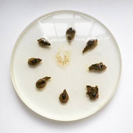
In a project called Mummy Shit Lab, the students assigned themselves the roles of poo-producer, refiner and enhancer. The producer followed a strict diet and exercise regime for the duration of the project, and produced samples of excrement that were examined by the refiner, then freeze-dried and preserved in disks of epoxy resin by the enhancer.
The team hoped that by presenting the process, they could help themselves as well as visitors overcome the instinctive feeling of revulsion towards faeces.
"The essence of mummification is the beauty of something transitory and displeasing like death being given an extension of its time in a beautiful, glorified way," said Shaakira Jassat. "After working on this project, every time I flush my shit away, it feels like a funeral – a goodbye to something I really find value in now."
The students claimed that there are elements of the scent of faeces that are appealing once the initial feelings of disgust are swept aside.
To test out this theory before embarking on the Milan project, they surveyed the favourite foods of the school's tutors and presented them with platefuls of excrement from a producer who had recently eaten the cuisine, with positive results.
To investigate the impact on gut bacteria, one student ate only bread for the duration of the exhibition. Loaves of intestine-shaped bread were produced on site to fuel the diet in a project called Make Bread Not Chairs.
Other projects included a filtration system to convert urine into liquid fertiliser and a portaloo with planted flowers, while course tutor Hendriks created a dovecote made from bricks of pulped newspaper.
The Pigeon Poo Tower was designed as a prototype for how city-dwellers could use the resources around them to fertilise and produce their own crops, while providing the urban bird population with homes. "It's like a five star hotel for pigeons," said Hendriks.
Over 400 projects relating to food and waste from the academy's history from 1976-2015 were detailed in a timeline around the wall of the exhibition space and a number of graduate projects were also on show.
These included a scent installation by graduate Mickaël Wiesengrün, who worked with Norwegian chemist Sissel Tolaas to recreate the smells that would have been present in the former factory space were among these projects. A Willy Wonka-inspired popcorn machine and a 3D printer that uses clay to produce vases were also shown.
In the exhibition gardens, Food Curators set up a food factory to serve breakfasts and lunches of savoury and sweet "sausages" made from mulched rice pudding and couscous.
The students ran an advertising campaign to drum up interest for the show. Wearing Teenage Mutant Ninja Turtle-style poo-shaped shells, they travelled around Milan handing out biscuits piped with swirls of brown and employed guerrilla tactics by targeting the billboard campaigns of brands such as Ikea with "eat shit" stickers.